Illustrate data! Use the shape of a line graph as inspiration for kids’ art.

I first came across the of idea of illustrating data, or using a line graph as the inspiration for an artwork, when an awesome barrier reef line graph artwork by Jill Pelto popped up on my Facebook feed. Not only is Pelto’s work artistically amazing, but I like the way her illustrations add context to the data being presented, encouraging the viewer to think about the data in a deeper way. Cool, huh?
So, one day when Jewel was feeling poorly and stayed home from school, we decided to do a little homeschooling and give our own version of “graph art” a try.
Suitable for
Jewel was almost 9.5 years old when we did this. I think this could be adapted to suit grades 3-6, or extended for early high school kids. Actually, it’s kind of fun for adults too.
How to create Graph Art (or Data Art)
These are the basic steps we followed:
- Think of a topic that you want to illustrate
- Research the available data, and see if you can find data that can be easily graphed as a single line graph.
- Conceptualise how you could use the shape of the line graph to create an illustration that is relevant to the topic.
- Create your graph art!
I love the way this activity combines several of the pillar STEAM (or STEM + Art) pillar subjects in the one open-ended activity. If you’re looking at trends in scientific / climate data, then you have the Science pillar right there. If you enter the data into a spreadsheet and create your own graph, then that’s your Technology and Maths ticked off. And of course the artistic component is the Art pillar. And because kids can choose the topics they’d like to research, and what they’d like to draw, it’s lovely and open-ended. So, tick, tick, tick, tick! (Let’s just leave the ‘Engineering’ bit for next time. 🙂 )
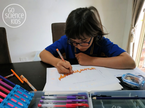

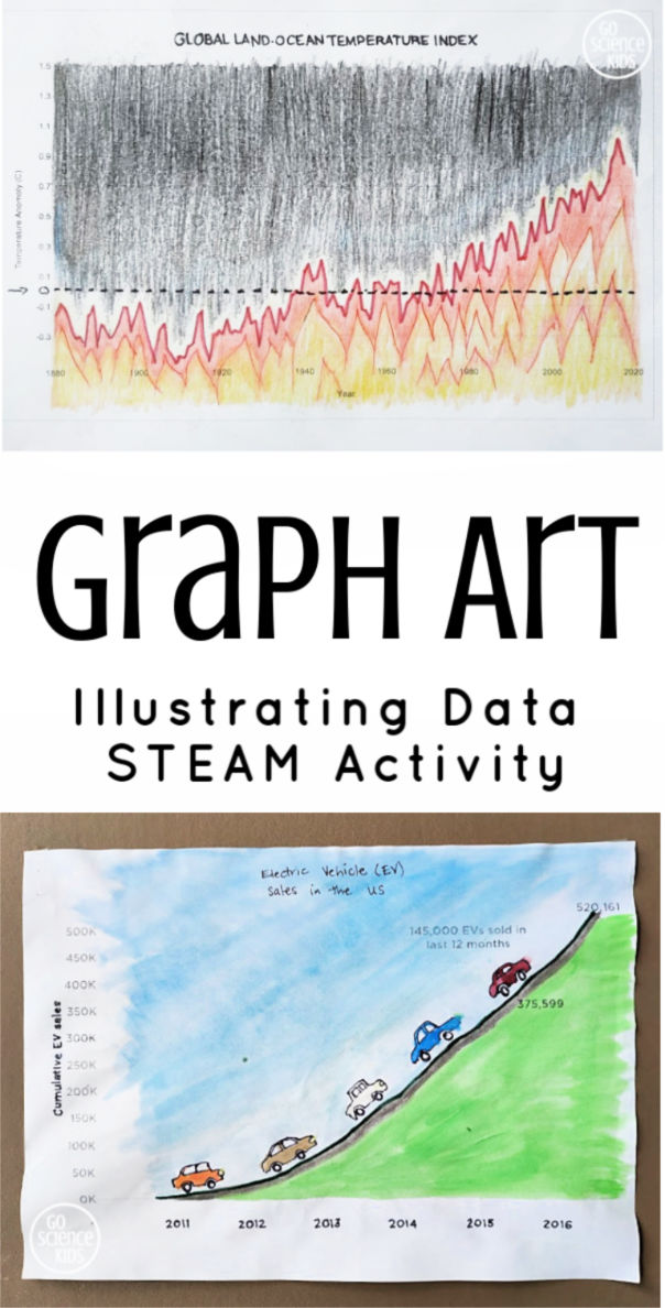
For our first artworks, Jewel and I looked at global temperature data from NASA. We thought that the annual mean temperature anomaly, (i.e. how much the annual temperature is different from the average), looked very spiky, like the tops of flames, which is a relevant image, as the graph is showing that temperatures are heating up! We downloaded the original data into a spreadsheet, created a basic line graph, printed this onto paper, and then used this as the basis for our art. Jewel and I used a combination of pencils, gel pens and marker to create these two artworks below.
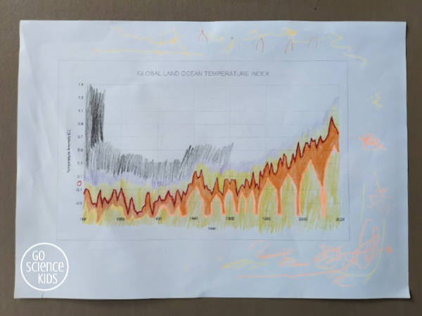
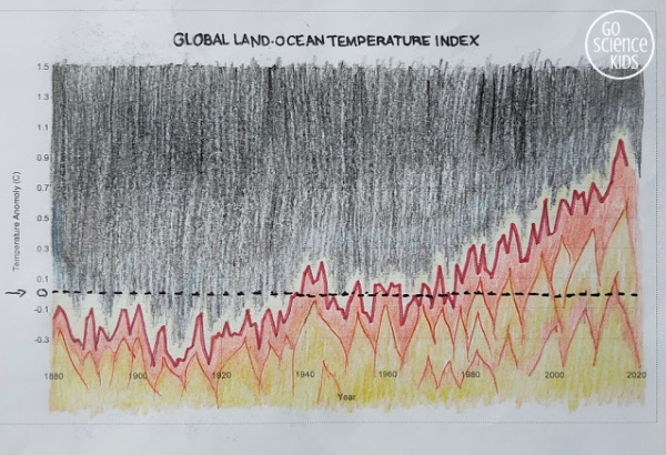

Let me explain this graph a little bit. The x axis is the years, from 1880 (the year that climate data was first reliably recorded), until 2018 (last year). The y axis shows the temperature anomaly, or how much temperatures vary from the average. Can you see the dotted line above? That’s represents zero change from average. So, if the climate were staying more or less consistent, then you would expect the temperature to fluctuate on either side of this dotted line as the years progress. But the graph above shows a distinct upward trend, meaning that the temperatures are becoming a much higher than average. The top of this graph is 1.5 degrees higher than average, which is the point that many scientists say is the ‘tipping point’ for climate change. And if you follow the graph’s trend, that tipping point is fast approaching…. Scary stuff.
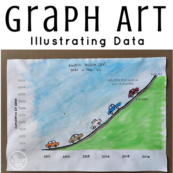
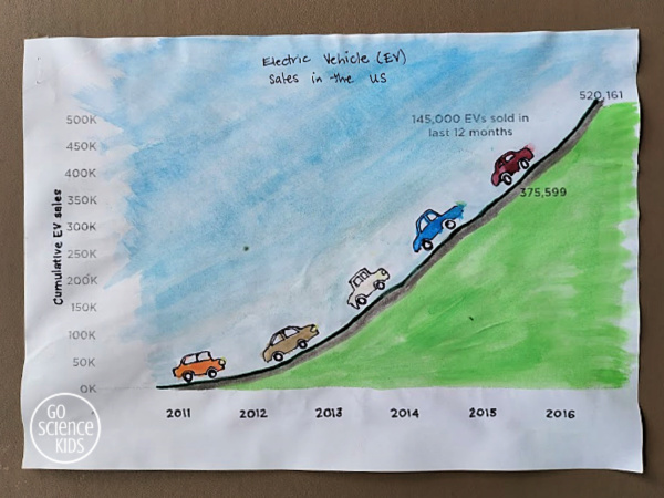
Jewel wanted our next graph art to focus on something more positive. She wants to focus on what we are doing to fix the world’s problems! So we started brainstorming positive topics that we might be able to find data for. We found these “good news graphs“, which are all very cool! The decreasing cost of solar electricity has a lovely downward curve which would make a great graph art topic.
But in the end Jewel and I decided to try illustrating the increase in electric vehicle sales in the US, partly because we’re considering buying an electric car ourselves, and partly because we found an electric vehicle sales graph we could print straight from the Internet (thus saving us the steps of having to find / download the data and create the graph ourselves). We used black marker and watercolour paints.
For more math art ideas, my blogging friend Karyn from the fabulous Teach Beside Me blog (which, incidentally, is one of my favourite blogs of all time!) has just released an awesome new book called “Math Art & Drawing Games for Kids” that looks really cool. It has over 40 fun art projects that also build math skills! You can find it on Amazon here (please note, this is an affiliate link). But don’t tell Jewel about it yet, as she might be getting this under the Christmas tree this year!
Or for more arty or crafty STEM ideas, you might like to check out our STEAM activities page. (This page is live updated whenever we post a new idea, so be sure to check back often).
You might also like to follow our Go Science Kids and Fun Science for Kids boards on Pinterest.
And, of course, you can always subscribe to our newsletter, to receive all our latest activities straight in your Inbox.